Sunday, December 4, 2011

Autumnal


"Autumnal"
oil and enamel on paper-mounted panels, each 3" x 2.5"
3 hanging options, 2011

Homing Pigeons


"Pigeon"
oil and enamel on paper-mounted panel, 3" x 2.5" 2011


"Homing"
oil on paper mounted panels, triptych, each 8" x 7.5" (8" x 22.5" total)
2011


Homing detail


Contrails


"Contrail"
oil on paper-mounted panel, 6" x 5.5"
2011

Our Lady


"Our Lady" (night)
oil on paper-mounted panel, 15" x 17" 2011


"Our Lady" (day)
oil on paper-mounted panel, 15" x 17", 2011


A nod to Velazquez while exploring the idea of the halo or ring of stars. Letting the symbol stand alone, deity removed (in this case the Holy Mother) creates an interesting tension; the aura of spirituality without the figurative elements. As a lapsed catholic and a painter I think its useful to confront, or at least start a dialogue with roman catholic iconography, the backbone of western painting. It also reminded me of certain miracle visions, such as Our Lady of Fatama, which is a truly strange episode with apocalyptic secrets passed on to unsuspecting, yet devout children, culminating in a blinding mid-day apparition confirmed by an entire town.
Religious iconography, and the stories they serve to better tell, present us with a fascinating intersection between faith, natural phenomena and the ability of the mind to extrapolate meaning from both.


Monday, October 31, 2011

Double Exposure


"Lapse"

oil on paper mounted panel, 8" x 6.75", 2011


"lapse"- detail

A kind of abrupt return to figurative work, "Lapse" represents a kind of culmination of certain proclivities and directions that have shown up in my work in the past year. Playing with the distorted image, doubling and visual confusion that more directly talks about movement or time passing (in this case, time enough to glance down). In many ways this painting feels new, bold and challenging, but it also feels very much like where I left off with figurative concerns- it feels like a MICA painting; it also unabashedly references my favorite figurative painters, Vuillard, Sargent, Uglow, Saville...not that this diminishes the spark of the painting. If anything, it's like comfort food, or a new way of telling a familiar story. And hopefully the yellow, which has an associative significance for me, off-sets that ubiquitous Baltimore gray that I tried so hard to un-learn.


"Yellow shirt"
oil on paper-mounted panel, 8" x 6.75", 2011

Pigeon Camera

"Pigeon Camera"

oil on paper-mounted panel, with PVA and pencil. 8" x 7", 2011


Pigeon Camera- digital study


More Trees


"Most Everything Does #2"
oil on two paper-mounted panels, each 7" x 4.25"

Part two of trees and phone lines.
I like how the color gradation can be interpreted as both dawn and dusk, beginning or end.


Detail of panel preparation. Paper mounted panel, primed with gesso, and cut into a grid relief within both panels, that is then primed with PVA. The variation in surface height allows for interesting textures as well as the painting sitting "within" the rest of the surface. I don't think I would do this for every painting, but surface wise, it made sense for these compositions.


Monday, July 25, 2011

Reference Journal


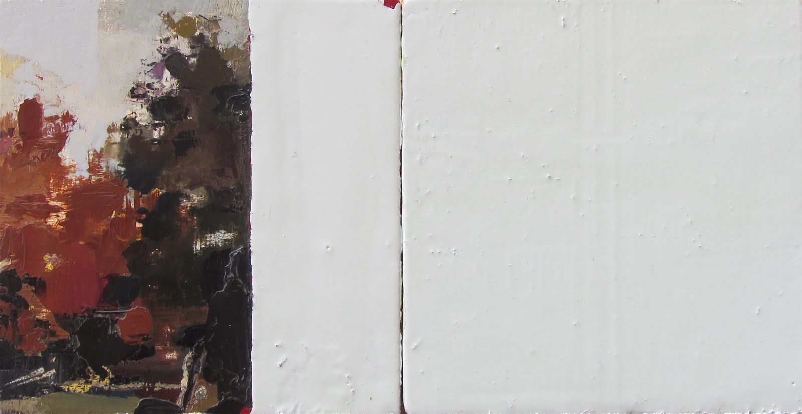
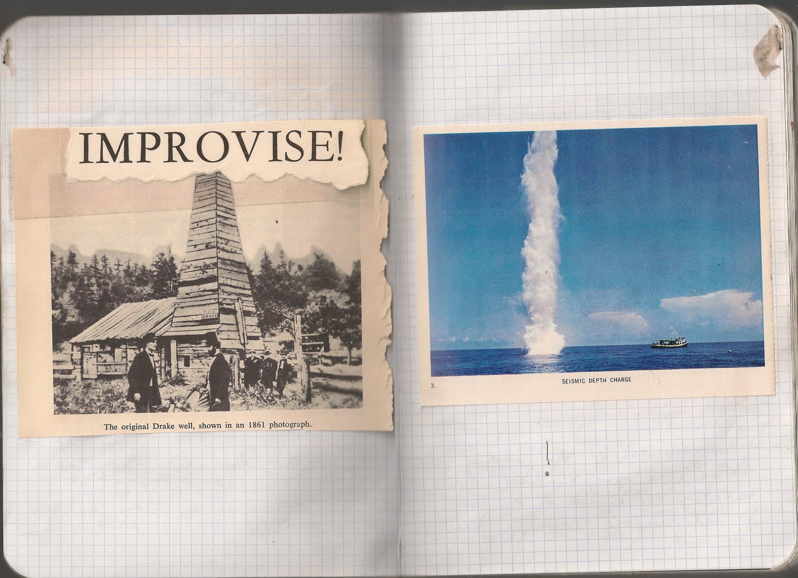
Various pages from my reference journal / image log / study archive.
Print-outs, type samples, photoshop compositions, notes and various types of tape.

So at some point I started keeping a reference book. It's a hefty red-covered volume of gridded pages containing various source images and studies, culled from books, family albums or worked out in photoshop. I try not to do much drawing; it's intended to be a kind of un-edited flow of imagery that for whatever reason I find exciting, interesting or useful. There aren't any rules about what I put in the book and not everything makes it to a painting, but it is selective. The idea is to keep track of my aesthetic preferences so I can better understand where decisions come from. Of course, anyone could do this because everyone has aesthetic interests. I think these particular interests come from certain larger (perhaps sub-conscious) roots. In less convoluted terms, what we find attractive or interesting visually, stems from our unique, personal worldview. It can't be said that everything in the book has a psychological underpinning, but that's part of why it's interesting- you see patterns start to emerge. And images that don't seem related at first, might find echoes a few pages later. The idea of a visual log isn't really anything new to practicing art and I'm willing to bet that almost all artists keep some kind of log, in some form. I think it is an increasingly important practice, though, as our image-saturated world seems to sometimes be at the tipping point. (Google image search, camera phones w/filters, design everywhere) It can be hard to focus. And by keeping very literal tabs on what applies to my work at present and past, I can learn to ignore everything that doesn't. Until it does.

A progression:
Body of images----------> Body of work -----------------> An idea
(broad, but specific) (focused, but progressive) (singular concern)

Thursday, July 21, 2011

Some trees


"most everything does" 2011
oil on two paper-mounted panels, each 7" x 4.25"
hanging option 1


Same piece, hanging option 2

Again, taking advantage of the playful possibilities inherent in the diptych format. This also continues some of my recent interest in slightly skewed images. I enjoy the surprise of the compositional shift and hope it hints at something related to memory.
All of this is very much in the early stages, more to come.

Sunday, July 17, 2011

Comet Hyakutake


"Hyakutake" 2011
Oil and enamel on paper-mounted panel.
Each panel 8.75" x 8"

Saturday, July 9, 2011

Roost


"Roost" 2011
oil and PVA on two paper-mounted panels
3" x 3.5" each
diptych to be displayed in two possible arrangements.


Ideas about shelter, co-habitation, domestic geometry, etc.
I like the possibility of two different hanging options, each with slightly
different connotations. Composition can drive the psychology of the image.


Tuesday, May 31, 2011

In Progress


95% done. Just needs some subtle adjustments in terms of surface,
color, blurring, etc.


Detail of enamel blocks.


Detail of Pigeon feet part 2.


Untitled (for now) painting of pigeon w. comet Hyakutake
Very much still in the works; more to come.


detail of Pigeon feet.


Comet Hyakutake, still in progress, but close.

Portrait of the artist's father


"Vincent, '81"
Ink, oil and enamel on paper-mounted panel.
5.5" x 5.5"


A portrait of my father, the year he graduated medical school. Reverting back to a limited palette and subtle tonal gradation, in an attempt to a get at a familiar likeness. Lately, I've been attracted to images that represent, or conjure an idea of home or roots. It's maybe best described as painting "comfort food". My father's backyard comet photos, trees and family photos; these are the givens. Images tied to a personal history, as opposed to the interests that develop over time. The splitting of the portrait is a way of not getting too comfortable, or to hint at some tension that might exist with images like this. It hopefully creates a kind of visual buzz that causes a double take, makes you look closer at the face depicted.


Thursday, April 28, 2011

New Works- In Progress


as of yet untitled portrait of father, w. green block.
ink, oil, PVA and enamel on paper-mounted panel.
still in progress.


"Island"
oil, PVA and enamel on paper-mounted panel.


"Comet Hyakutake"
oil, PVA on paper mounted panels.
very much still in progress.


Friday, February 25, 2011

Bull's Eye Bouquet


"Bull's Eye Bouquet"
oil and enamel on paper-mounted panel. 8.5" x 7.5" 2011


detail of flowers and lettering.

The successful realization of a painting that I've wanted to make for a very long time. It was extremely fun to paint, to play at being Sargent a little bit. Some of the best flowers happen in his paintings, not to mention Uglow. The phrase was originally meant as a reference to peacocks, but applying it in a more literal sense works too. One of the things that draws me to the use of text, besides a way of graphically glorifying a title, is the conceptual tension that words can play against the image. In this case, the phrase is a suitable partner to the floral arrangement presented, but it also offers a way out of the literal, as a "bull's eye bouquet" is something all together different from what we might normally think of as a floral arrangement. With paintings like this, I am hoping for an composition that allows for a variety of individual interpretations within a framework of deliberate mark-making. Still pushing a clear idea, but allowing for some thinking space around it. I don't want to say it all. These days, I measure success in painting by how much they surprise me. If they don't keep me guessing afterwards, then they probably won't be much good to anyone else either.


Work in Progress- Yellow Drum


Yellow drum painting. Currently being picked apart, sanded and re-painted for the third time.
It's a tough one. Trying to relate it to "Paradiddle" and "Black Drums" in a way that goes beyond the subject matter. Finding a balance between building and taking apart. More to come.

Black Drums


"Black Drums (un-snared)"
oil and graphite on paper-mounted panels, joined diptych. 9.5" x 16.5" 2011

Tuesday, February 8, 2011

Recent Influences- Drum Paintings


After starting the fourth painting of drums, I started to mine the library for possible reference points, or influences that I may have overlooked. Though a painting like "Paradiddle" was originally inspired by a WPA photograph of a marine drummer, the subsequent works are turning out to be something different. It's more about the idea of combining landscape with these monumental, floating objects in a way that feels natural. The way the painting asserts itself, and (hopefully) the consistency of light will make these paintings believable. I was reminded of the water-towers of Bernd and Hilla Becher last week while working on the new photo show at the MFA (Conversations). They are great to look at to get a sense of immense weight as well as the gratifying bulk of elliptical forms. This led me back to a more ingrained influence from childhood- the fantasy story of "Cloudy with a Chance of Meatballs". If you're not familiar with the land of Chewandswallow, it is a place where food falls from the sky and meals are dictated by weather patterns. This book is one of my earliest visual memories; the illustrations by Ron Barrett are amazing- beautifully composed with humor and a sort of epic sense of scale (pancake covers school, man lost in pea soup fog). Looking through it again, I was struck by the Jell-o mold image, as well as the hamburgers floating in the sky (see above). All objects that don't belong, set convincingly in the landscape. It's a kids book, but then again I'd consider the drums to be a sort of fantasy element as well; an instrument indicative of rhythm, order and action. As the paintings continue to develop and change, it's good to identify these reference points and for me, it's one of the more interesting parts of making art; making work and finding clues afterwards.


Study for a Halo


"Study for a Halo (After Velazquez)"
oil on paper-mounted panel, 5.25" x 5" 2011